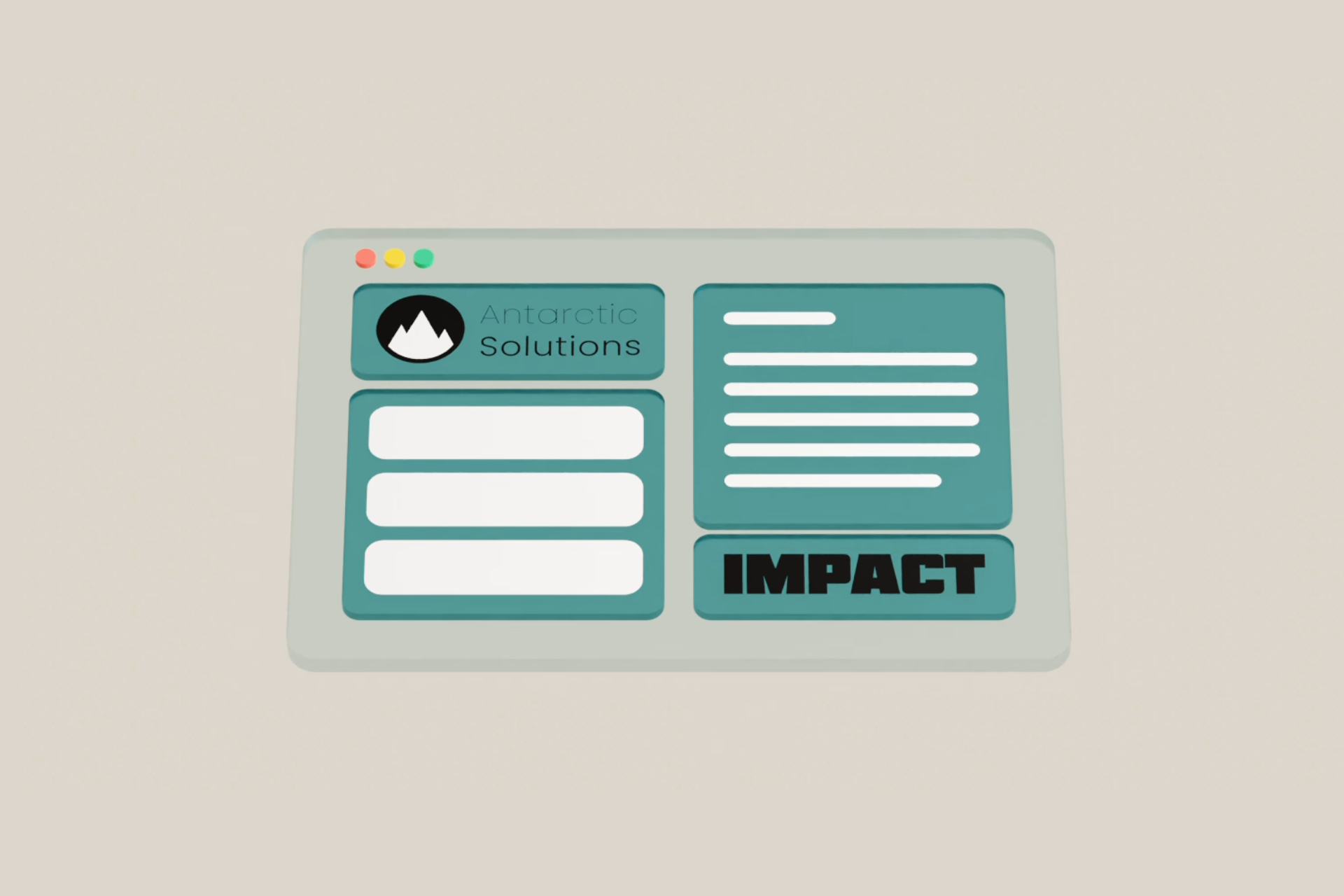
How we Refreshed our Look
How we refreshed our look with 3D animations and interactivity!
- Published on

2 min read
Antarctic Solutions has a new look! ✨ Check it out now at antarcticsolutions.ca to see our new look!
Here is a comparison side by side of the two (of course there are animations but no animation is show here)
New site:
Old site:
Why
We wanted to show who we are and what we are about but the old site was not impressive in terms of conversion rates. The new site pops out and is much more professional. New 3D animations and interactivity makes it much more appealing to potential clients.
Process
The process of this new website took only a few days to develop but just short of 2 weeks of planning on and off. Here is the process for developing it as a step by step
- Brainstorm possibilities
- Commit a rough sketch on paper (storyboarding)
- Gather feedback
- Gather all the assets needed for animations and motion graphics, ie 3D assets, motion graphics, etc
- we created our assets in house! We mainly use Blender for the 3D assets and Adobe After Effects for the motion graphics
- Create a high fidelity prototype (using Figma)
- Get it reviewed within the office
- Coding it up (we used Reactjs + framer-motion for the on scroll events)
- Wrapping up and deploying to the web (Vercel) 🥳
This all wrapped up in 4 days and we couldn't be happier with the result! Hope you learned something about the process. If anything else, let this provide you inspiration for your works!